Node2vec embeddings tutorial
One of the hottest topics of research in deep learning is graph neural networks. The last few years saw the numbers of publications regarding graph neural networks grow in some of the major conferences.
One of the hottest topics of research in deep learning is graph neural networks. The last few years saw the number of publications regarding graph neural networks grow in some of the major conferences such as ICML and NeurIPS. One of the first models to use neural networks and show a considerable improvement on the tasks of node classification and link prediction was node2vec. The paper by researchers at Stanford University, uses advances made in nlp to generate embeddings of nodes for use in downstream tasks. Node2vec creates a series of random walks of the nodes in a network and uses those sequences as the input data for the embedding algorithm, in this case the skipgram model of word2vec.
This innovation directly addressed one of the complexities of working with graph data the irregularity of the data structures in networks. While images can be represented as grids of pixels, and text can be represented as sequences of symbols, this is not applicable to graphs. Graphs do not have fixed node ordering or a reference point (beginning or end), there is also a wide variation in the structure of the graphs; e.g. one node can be connected to 100 nodes while another one may only have one connection. The authors also highlight the limitations of more traditional techniques such as dimensionality reduction for node classification since they scale poorly to large networks and the resulting representations perform poorly in downstream tasks. See this really great explanation on why node2vec excels where previous models failed by Jure Leskovec one of the authors of the original paper and a lead researcher on the field.
Representation of a graph as nodes in a embedding space
source: https://ai.googleblog.com/2019/06/innovations-in-graph-representation.html, from the original DeepWalk paper.
Besides the idea of using embeddings to represent the data the model introduces the concept of biased random walks. Unlike a regular random walk, the model proposed by node2vec has parameters p and q that help the random walk to implement different exploration strategies. The return parameter p controls the likelihood of immediately traveling back to a node recently traversed, and as such it can favor a breadth first search (BFS) where we explore local neighborhoods and find embeddings that better capture structural equivalence. The in-out parameter q controls the likelihood of walking away from the previous node and as such can favor a depth first search (DFS) which in turn produces embeddings that better capture homophily. This post provides a good explanation of the biased random walks and how the distance from the original node and the nodes in the neighborhood of the subsequent node are affected by the p and q parameters. To put it simply the authors generate random walks for each node to serve as sentences, and then use those sentences as an input for a shallow embedding model. After those embeddings are obtained they are used in downstream tasks, primarily node and link prediction.
The dataset that I will use for this tutorial is the bike trip data from Capitol Bike Share. The data comprises several million trips made between 2010 and 2020. I processed every trip as an adjacency list where the weights correspond to the number of trips made between each pair of stations. The script to create the data can be found here. To implement the node2vec algorithm I am using the library stellargraph, a graph machine learning library written in Python developed by Australia’s national science agency. This library contains many graph neural networks models as well as some datasets and demos. I will be using the node2vec implementation that uses gensim as the engine to produce the embeddings with the skip gram algorithm; they also provide a Keras implementation for the word embeddings section.
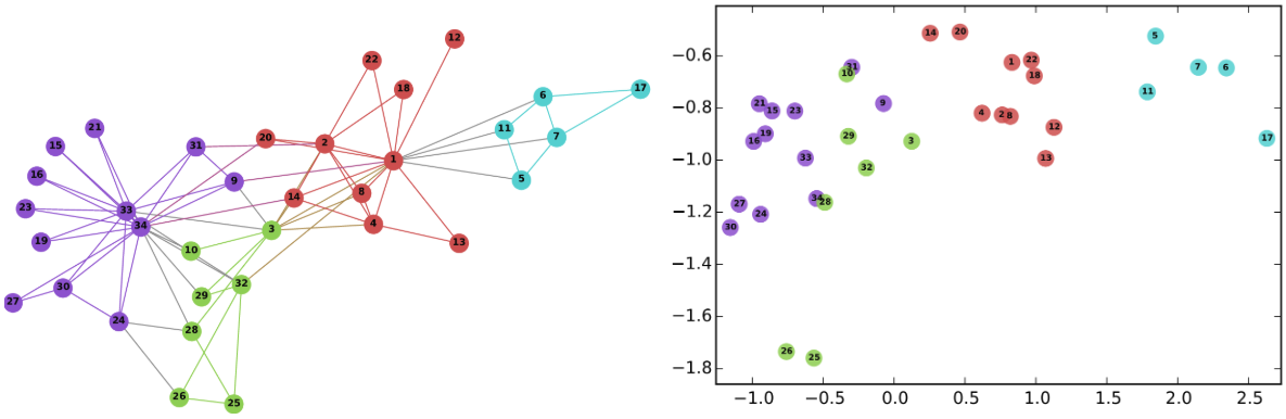
As mentioned in the node2vec paper the authors evaluated the performance of the model on node and link prediction tasks for different datasets. For this task the nodes in the data do not have a natural label to evaluate the performance of the model in a downstream task. So I will limit my analysis to generate embeddings and clustering those embeddings; this is similar to the exploration of the Les Miserables data in the original the paper. Specifically, I would like to cluster bike stations based on the role they play in the network; e.g. does a particular station serves as a hub or not.
The first step in the analysis consists on preparing the data to be analyzed in a format that stellargraph can recognize. The library can import an edge list from a data frame as long as the columns are specified in the right format with the edge pairs named ‘source’ and ‘target’ and any additional attribute for the edges after. In this case I saved the data in the appropriate format so importing it into stellargraph is trivial. I simply load the csv file as a data frame and initialize a weighted directed graph.
It is also worth nothing that while other versions of node2vec exists the stellargraph library makes the implementation of biased random walks for directed weighted networks possible.
import pandas as pd
import networkx as nx
from gensim.models import Word2Vec
import stellargraph as sg
from stellargraph.data import BiasedRandomWalk
import os
import zipfile
import numpy as np
import matplotlib as plt
from sklearn.manifold import TSNE
from sklearn.metrics.pairwise import pairwise_distances
from IPython.display import display, HTML
import matplotlib.pyplot as plt
import igraph as ig
%matplotlib inline
# read csv data
graph_data = pd.read_csv('../data/capital_bikes/graph_data_full.csv')
# instantiate a directed graph with our edge list
graph_bikes = sg.StellarDiGraph(edges = graph_data)
# check that the attributes are correctly loaded
graph_bikes.info()
'StellarDiGraph: Directed multigraph\n Nodes: 708, Edges: 150527\n\n Node types:\n default: [708]\n Features: none\n Edge types: default-default->default\n\n Edge types:\n default-default->default: [150527]\n Weights: range=[1, 42863], mean=175.382, std=688.561\n Features: none' ```
The resulting graph has 708 different nodes (some of the stations in the data no longer exists or moved address but I decided to include them in the analysis to get a more complete view of the network) and 150 thousand plus edges. For this graph the weights represent the number of trips between each station so we are in the presence of a directed weighted graph. Node2vec can manage both directed and undirected as well as weighted graphs so there is no need to conduct any additional modification to the original data.
The next step in the analysis is to obtain a list of random walks that will serve as the input for the word2vec algorithm. As mentioned in the introduction the main decision we can make revolves around how much do we want to favor the creation of embeddings that capture homophily (communities) versus embeddings that capture the structural roles that the nodes play in the graph. Since I was interested in identifying bike stations that have similar structural roles I decided to encourage exploration of nodes in a breadth first fashion. I use the parameters defined in the paper such as length of the random walk set to 80, number of random walks per root node to 10, a return value p of 0.25 to foster local exploration and an out parameter q with a value of 1.
For the word2vec model I use 128 dimensions for the resulting embedding, a window size of 10, 20 epochs of training and other default parameters of the gensim word2vec implementation.
rw = BiasedRandomWalk(graph_bikes, p = 0.25, q = 1, n = 10, length = 80,
seed=42, weighted = True)
walks = rw.run(nodes=list(graph_bikes.nodes())
# root nodes
)
# we pass the random walks to a list
str_walks = [[str(n) for n in walk] for walk in walks]
After the random walks have been generated we parse them into a lists of lists. This is an easy way to feed the data to word2vec to generate the embeddings. Since we have 708 nodes and we conducted 10 random walks per node we will have 7,080 walks to feed into the model; these walks are analogous to sentences in the word2vec model.
After the model has run we find the most similar nodes in our network when compared to each other as measured by cosine distance. For example let’s see what are the most similar stations to the bike station on the Convention Center in Downtown DC. This station is located in a central part of town, next to a metro station, and in an area with lots of foot traffic.
# run the model for 20 epochs with a window size of 10.
model = Word2Vec(str_walks, size=128, window=10, min_count=1, sg=1, workers=4, iter=20)
# check for the most similar station in the embeddings space
model.wv.most_similar('Convention Center / 7th & M St NW')
[('5th & K St NW', 0.6973601579666138),
('8th & O St NW', 0.6972965002059937),
('8th & H St NW', 0.6935445070266724),
('Metro Center / 12th & G St NW', 0.6875154376029968),
('11th & M St NW', 0.6858331561088562),
('7th & F St NW / National Portrait Gallery', 0.684096097946167),
('Largo Town Center Metro', 0.6574602127075195),
('1301 McCormick Dr / Wayne K. Curry Admin Bldg', 0.6564565896987915),
('15th & K St NW', 0.6558513045310974),
('Thomas Circle', 0.6542125344276428)]
The most similar stations are almost all in downtown DC and many of them are near a metro station, so this looks promising. But to really understand if we are capturing homophily or structural roles I am going to cluster all the embeddings of our nodes and see if the resulting clusters reveal structural equivalency of the nodes.
# Retrieve node embeddings and corresponding subjects
node_ids = model.wv.index2word # list of node IDs
node_embeddings = (model.wv.vectors)
I use k-means, the work horse of clustering algorithms and also the algorithm implemented in the node2vec paper, as well as Hierarchical Density-Based Spatial Clustering (HDBSCAN) to identify clusters of nodes. HDBSCAN uses a density-based approach that looks for regions of the data that are denser than the surrounding space and defines clusters based on densely populated regions. The algorithm creates a circle around each point in the data based on the parameter min_samples till it encompasses the number of points defined by this parameter, in practice it is set to the same value as min_cluster_size. The circle will have a radius equal to the longest distance to the farthest point in the neighborhood with the points defined in the previous step; this is known as core distance.

source: https://hdbscan.readthedocs.io/en/latest/how_hdbscan_works.html
The algorithm then evaluates how easy it is to get from one circle to another one, that value is known as mutual reachability distance. The algorithm then uses an implementation of minimum spanning tree to build the hierarchy of clusters. Finally, HDBSCAN walks through the tree and at each split checks if the new cluster created by the split has fewer points than the minimum cluster size, if this is true then drops those points as noise and keeps the points in the parent cluster. If the split has the minimum size of points define the algorithm considers the split valid and a new cluster is created. The algorithm stops once the entire tree has been traversed. The documentation of the python library explains this process quite well. Also this post goes more in depth on how the algorithm works.
For k-means we have to rely on the elbow method to identify the optimal number of clusters. HDBSCAN does not require that we set the number of clusters in advance.
from sklearn.cluster import KMeans
from sklearn import metrics
from scipy.spatial.distance import cdist
import numpy as np
import matplotlib.pyplot as plt
distortions = []
K = range(3,16)
for k in K:
k_cluster = KMeans(n_clusters=k, max_iter=500, random_state=3425).fit(node_embeddings)
k_cluster.fit(node_embeddings)
distortions.append(k_cluster.inertia_)
# Plot the elbow
plt.plot(K, distortions, 'bx-')
plt.xlabel('k')
plt.ylabel('Distortion')
plt.title('The Elbow Method showing the optimal k')
plt.show()
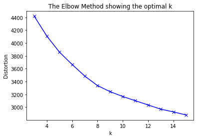
The elbow method suggest the optimal number of clusters is somewhere around 10.
For HDBSCAN we will select as the minimum cluster size at 5.
# get k-means clustering for 10 labels
kmeans_cluster = KMeans(n_clusters=10,
init='k-means++', n_init=300, random_state=3425).fit(node_embeddings)
kmeans_labels = kmeans_cluster.labels_
# run the HDBSCAN cluster
import hdbscan
hdbs_model = hdbscan.HDBSCAN(min_cluster_size = 5)
hdbs_model.fit(node_embeddings)
hbds_scan_labels = hdbs_model.labels_
# create a dataframe of the nodes with their cluster labels
nodes_labels = pd.DataFrame(zip(node_ids, kmeans_labels, hbds_scan_labels),
columns = ['node_ids','kmeans','hdbscan'])
Now that we have the cluster labels lets explore the results of the embeddings produced by node2vec using t-distributed stochastic neighbor embedding (t-SNE) to visualize clusters. The algorithm converts the high-dimensional euclidean distances between data points into conditional probabilities trying to preserve close points together under a Gaussian distribution. The algorithm maximizes the probability density of a pair of a points where nearby points will have a high probability while farther points will be separated. Once this is identified t-SNE tries to represent the data in a lower dimensionality (usually 2 or 3 dimensions) using gradient descent. Finally the algorithm uses a t distribution to compute the similarity between two points in the low-dimensional space. This post summarizes the algorithm in more detail. This technique proposed in a paper by van der Maaten and Hinton (yes the same Hinton that played a key role in the development of deep learning) has become a very common algorithm to represent high dimensional data in a 2 or 3 dimensional space.
The algorithm is easy to implement but does require tinkering to obtain the desired results, specially with the perplexity and early_exaggeration parameters. The values shown below are the ones that worked better for this case.
# fit our embeddings with t-SNE
from sklearn.manifold import TSNE
trans = TSNE(n_components = 2, early_exaggeration = 10,
perplexity = 35, n_iter = 1000, n_iter_without_progress = 500,
learning_rate = 600.0, random_state = 42)
node_embeddings_2d = trans.fit_transform(node_embeddings)
# create the dataframe that has information about the nodes and their x and y coordinates
data_tsne = pd.DataFrame(zip(node_ids, list(node_embeddings_2d[:,0]),list(node_embeddings_2d[:,1])),
columns = ['node_ids','x','y'])
data_tsne = pd.merge(data_tsne, nodes_labels, left_on='node_ids', right_on='node_ids',
how = 'left')
# plot using seaborn.
import seaborn as sns
plt.figure(figsize=(10, 10))
sns.scatterplot(data=data_tsne, x='x', y='y',hue='kmeans', palette="bright",
alpha=0.55, s=200).set_title('Node2vec clusters with k-means')
plt.savefig('images/kmeans_node2vec.svg')
plt.show

We can see that k-means produced clusters that are clearly separated with a few overlaps. There seems to be a large central cluster (2) as well as smaller but well separated clusters. Now lets see how the HDBSCAN clusters look.
plt.figure(figsize=(10, 10))
sns.scatterplot(data=data_tsne, x='x', y='y',hue='hdbscan', palette="bright",
alpha=0.75, s=200).set_title('Node2vec clusters with hdbscan')
plt.savefig('images/hdbscan_node2vec.svg')
plt.show

HDBSCAN found 8 clusters, 2 less than k-means, with a large central cluster (6) and a few small but densely populated clusters. It is also important to mention that HDBSCAN assigns individual points to the noise cluster (-1 in the plot) if they can bot be attributed to a single cluster.
However it is hard to know the significance of these clusters. To get a better idea if they are clusters of nodes that share similar structural role I will plot the bike stations on a map color coded by their cluster membership. For this plot I use plotly since it is a nice and quick way to produce an interactive map of the stations.
import plotly.express as px
import plotly.offline as py_offline
stations = pd.read_csv('../data/capital_bikes/bike_locations.csv')
stations = pd.merge(stations, nodes_labels, left_on='ADDRESS', right_on='node_ids',
how = 'inner')
stations['kmeans'] = stations['kmeans'].astype(str)
stations['size'] = 5
fig = px.scatter_mapbox(stations, lat="LATITUDE", lon="LONGITUDE", hover_name="node_ids",
hover_data=['node_ids'],
size = 'size',
size_max = 10,
zoom=10,
width=700, height=600,
color_discrete_sequence=px.colors.qualitative.Plotly,
color = 'kmeans',
)
fig.update_layout(mapbox_style="carto-positron")
fig.update_layout(margin={"r":0,"t":0,"l":0,"b":0})
fig.show()
Looking at the resulting plot we can see that the clusters correspond almost one to one to regions of the DC metropolitan area. For example cluster 2 corresponds to central DC and includes the most populous neighborhoods. Cluster 8 in orange corresponds to Arlington, cluster 6 contains stations in Alexandria, while cluster 1 contains Reston and Tysons Corner all of them in Virginia. The clusters seem to be capturing homophily as the clusters are determined by geography; similar stations are also stations in the vicinity of each other.
Let’s see if HDBSCAN clusters also capture the homophily of the stations.
import plotly.express as px
stations = pd.read_csv('../data/capital_bikes/bike_locations.csv')
stations = pd.merge(stations, nodes_labels, left_on='ADDRESS', right_on='node_ids',
how = 'inner')
stations['hdbscan'] = stations['hdbscan'].astype(str)
stations['size'] = 5
fig = px.scatter_mapbox(stations, lat="LATITUDE", lon="LONGITUDE", hover_name="node_ids",
hover_data=['node_ids'],
size = 'size',
size_max = 10,
zoom=10,
width=700, height=600,
color_discrete_sequence=px.colors.qualitative.Plotly,
color = 'hdbscan',
)
fig.update_layout(mapbox_style="carto-positron")
fig.update_layout(margin={"r":0,"t":0,"l":0,"b":0})
fig.show()
The HDBSCAN clusters also capture stations that are mostly near each spatially. Cluster 8 represents central DC; cluster 1 corresponds to Reston, cluster 0 Tysons Corner all of these in Virginia.
One of the drawbacks of the node2vec and the Deepwalk algorithms is that the results you obtain from these algorithms are shaped by structural characteristics of the networks and as result they may not really capture structural equivalency. Researchers from Hannover University and University of Stavanger showed that for directed graphs with low clustering, low transitivity and low reciprocity the biased random walks wouldn’t offer additional information that can be used during the creation of the embeddings to infere structural roles. Let’s see what if the clustering coefficient is low:
# check the structural characteristics of the graph
import networkx as nx
graph_bikes_nx = nx.from_pandas_edgelist(graph_data, 'source', 'target', ['weight'], create_using=nx.DiGraph)
graph_bikes_clustering_coefficient = nx.average_clustering(graph_bikes_nx, weight='weight')
graph_bikes_transitivity_coefficient = nx.transitivity(graph_bikes_nx)
graph_bikes_reciprocity = nx.reciprocity(graph_bikes_nx)
graph_bike_properties = {'clustering coefficient':graph_bikes_clustering_coefficient,
'transitivity_coefficient': graph_bikes_transitivity_coefficient,
'reciprocity': graph_bikes_reciprocity}
print(graph_bike_properties)
{'clustering coefficient': 0.0009101886691383712, 'transitivity_coefficient': 0.6945816318976256, 'reciprocity': 0.840115062414052}
Conclusion
Node2vec is a powerful technique to process network data for downstream tasks, establishing SOTA at the time of publication. In this tutorial I explored the capitol bike share data to identify bike stations based on the structural role they play by using a low value for the return parameter (p) when creating the random walks. According to the original paper this should result in BFS search that results in embeddings that capture structural equivalency. However, as demonstrated on the interactives the clusters mostly follow a geographical pattern that resembles homophily. More recent literature has pointed at the impact that structural characteristics of the graph can have on the quality of the embeddings. Additionally more recent models such as Role2vec propose ways to generalize to unseen nodes and to truly capture structural equivalency of nodes.